In what ways does your media product use, develop, or challenge forms and conventions of real media products?
Many conventions of up to date horror movies are mainly based around more ghostly parananormal sightings as it would be more frightening for the viewer, in our storyline we used this to our advantage. Our storyline was about a ghost girl trying to get her message across to a living human, this takes on forms and conventions from films such as Gothica. We thought this storyline would be easiest to pitch to a distribution company as if we needed it wouldnt have to be changed much from existing products. Many horror movie conventions such as villian, hero, dark colours, suspense and more was all included in our story but when it came to the trailer it was visible that we managed to challenge many conventions by adding some bright colours such as white and red, sounds that arnt meant to be there for focus purposes, E.g we added sounds such as dogs barking, wind to add focus to the image where usally it would take focus away.
our trailer kept the normal trailer conventions such as production logo, titles, and time limit. we also looked at existing horror teasers and used their fast paced cuts, eiry music and dark colouring.
How effective is the combination of your main product and your ancillary texts?
The ancillery tasks added to the effect of the trailer, we decided to keep the same look and feel from the trailer to the poster as this would help the effect more and make the trailer more reconisable to the audience. Looking at many posters to trailers we noticed that the same look and feel was combined and that on existing products we followed it let us reconise the film trailer through the poster. This is important to an audience as it will help film promotion very well, and will help any audience either by watching the trailer wanting to see the poster or by seeing the poster wanting to watch the trailer.Our effect was to be that of a logo, where ever a logo is printed it is reconised. Also the image we edited for the poster was also the focus of the trailer and if seen on a cover of a magazine could be identified very easily.
also the effect the poster gave of would be able to interest the audience without the trailer and want to see the film on that basis.
What have you learnt from your audience feedback?
from the audience feedback we have learnt that when seeing the production from our view is bias and we were proud of our work, yet when displayed for the audience to see it didn't meet their expectations, when the questionaires came back to us we could see the problems ourselves and worked as a team around them, many of the problems we such things as slow editing and not enough suspense, at first we thought this was fine but we had to work around a way to correct these prblems as we had to learn more about Adobe after effects to get more out of our trailer. Our poster also had faults and needed changes, our feedback helped us know what our audience needed, this helped us make changs such as credits on the poster and more infomation. when we got the feedback after showing the final matirial we know that we had our final project and that changes didnt need to be made.
The feedback helped us learn more about the production process and the technology used.
How did you use new technologies in the research and planning, construction and evaluation stages?
through the stages of coursework technology helped me in the form of my blog and other software, from the start of my coursework i created a blog on http://www.blogger.com this allowed me to update my coursework everytime i did a new thing such as research and planning to contrsuction and evaulation. I was able to use other web 2.0 media incoparated into my blog such as videos from http://www.youtube.com and images uploaded straight to the blogger server.
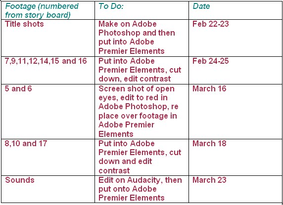
through the trailer editing process we used Adobe Premier, a video editing suite that allowed us to put titles, effects to our videos and cut and trim the trailer to fit our time limit, We used fonts for the titles from http://www.dafont.com and used the image files to edit in Adobe Premier, I also downloaded sounds from http://www.sounddogs.com and we used them in the editing process, i also used a video conversion software called Video To Mp3, this helped me download the song we needed to use for the final edit.
for the edited poster layers of iamges were used in Adobe Photoshop and edited to create the final image then fonts edited from http://www.dafont.com were placed on top. this was similar for the magazine cover design yet Macromedia Freehand MX was used to help create the layout for the cover itself with variuos images downloaded from http://www.images.google.com
Tuesday, 11 May 2010
Monday, 10 May 2010
Links
Throughout the blog i have put links to other infomation on either Lyndsay's or Tessa's Blog. Thses are labeled "Click Here".
otehr links to infomation are websites refering to other media we have used.
otehr links to infomation are websites refering to other media we have used.
Feedback.
we presented our trailer, poster and magazine cover design to the class with questionaires to see other peoples views and how we could change the desigsn and trailer to make it better fitting to conventions and what we needed to achive.
to see our results click here.
we took all feedback and changed layouts of the psoter, magazine and trailer to fit how others saw the matirial. the feedback became helpful and helped us develop our skills at this stage, we had then taken every detail into account and changed the way the trailer was edited to make it more fast paced and more easier to udnerstand the storyline.
Final trailer:
Final poster: 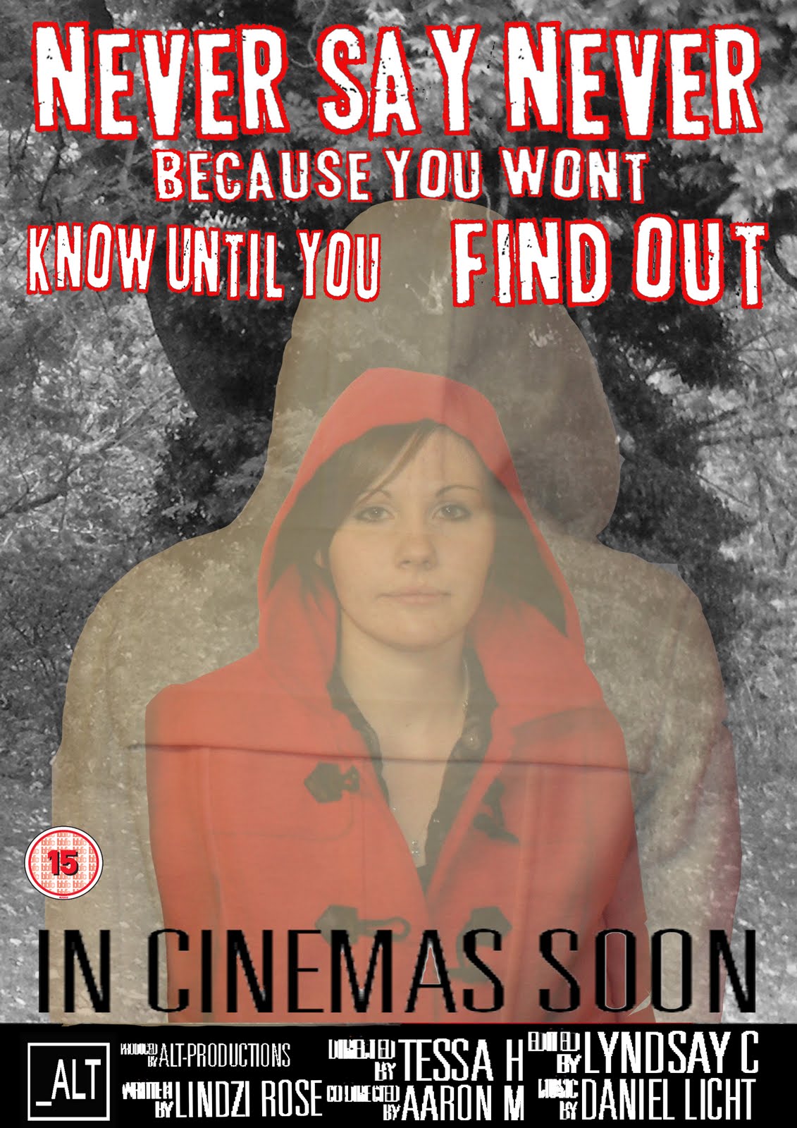
The final magazine cover was perfect, it didnt need editing at all and we managed to meet many more conventions when we got the second round of feedback as it met more peoples viewing targets this time around: to see these results click here
Film magazines
After the poster concept we then looked at film magazines and conventions, studying magazines for our As level coursework helped us in this task look at the conventions.
Existing magazines:
Taking ideas for these poster lyndsay and tessa worked togehter to produce a film magazine cover with our film as the key focus. this lead onto working with photoshop again and putting the key elements into the cover design.
Final cover design:
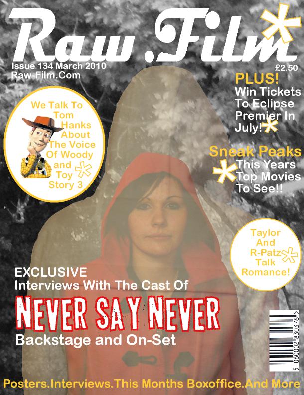
as you can see from the final design it meets the conventions of the cover with side stories and focus on our poster with use of fonts, iamges and colour.
Movie poster.
we started looking at conventions of movie posters such as credits, titles, logos and image layout.then we looked into the dark feel of the posters and how the contrast works.
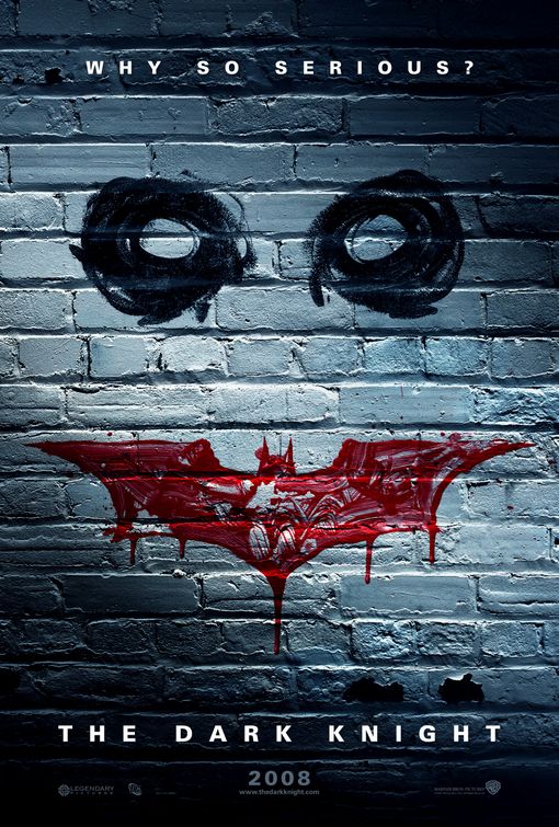
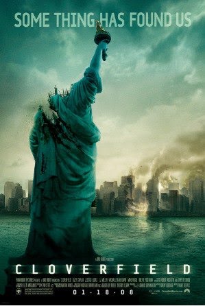
Existing posters: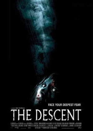
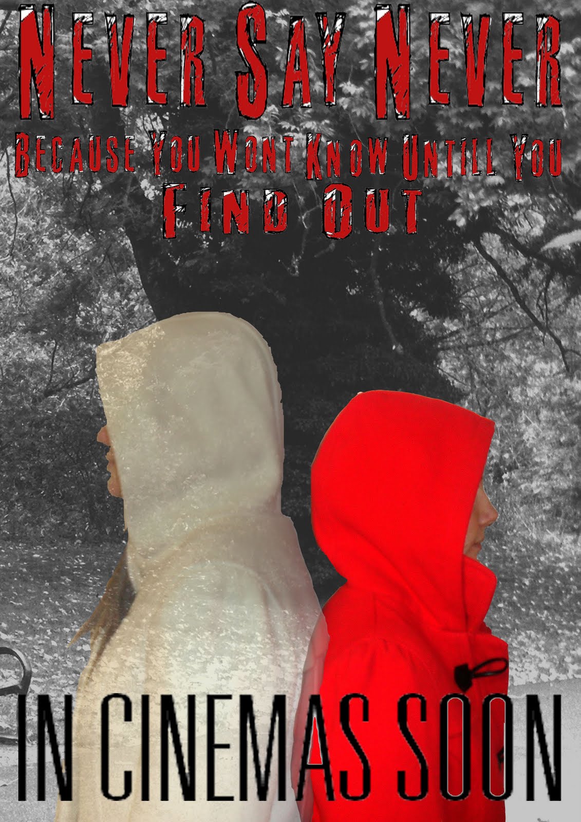
Lyndsay then took these idea's and used photoshop to come up with some poster ideas using the same fonts from the trailer and some edited images (to see full click here):
First Draft Poster:
Adding sound.
i used a website called http://www.sounddogs.com/ to find certain sounds that fit in with the conventions of horror movies. such as:
screams
footsteps
wind
doors
dogs barking
i aslo found some eiry music called blood theme. the song was composed by daniel licht and had a supressing mood to fit in with the trailer.
we also needed some original sound for the trailer so we borrowed a voice recorder and whispered the words "dont go into the loft", lyndsay then took this final sounds and edited it in a program called Audacity, once all sounds were compiled lyndsay then put them finally onto the trailer with the production logo.
first trailer edit.
Editing.
 Lyndsay found the fonts she wanted to use on a website called http://www.dafont.com each of the fonts had a horror feel to them: broken up and grunge look and feel.
 first font
Final Font.
 Lyndsay edited the fonts into Adobe premier and then fitted them into the trailer, this was a hard process as they were picture files and sometimes didnt lookright so we laned on a bold font. the final font.
Subscribe to:
Comments (Atom)
